Designing Brochures & Flyers for Dubai Audiences: Practical Tips That Get Read
Practical, locally grounded guidance on structuring brochures and flyers for Dubai’s mixed audience — language choices, typography, folds, offers and QR codes — plus common design mistakes to avoid so your print budget delivers results.

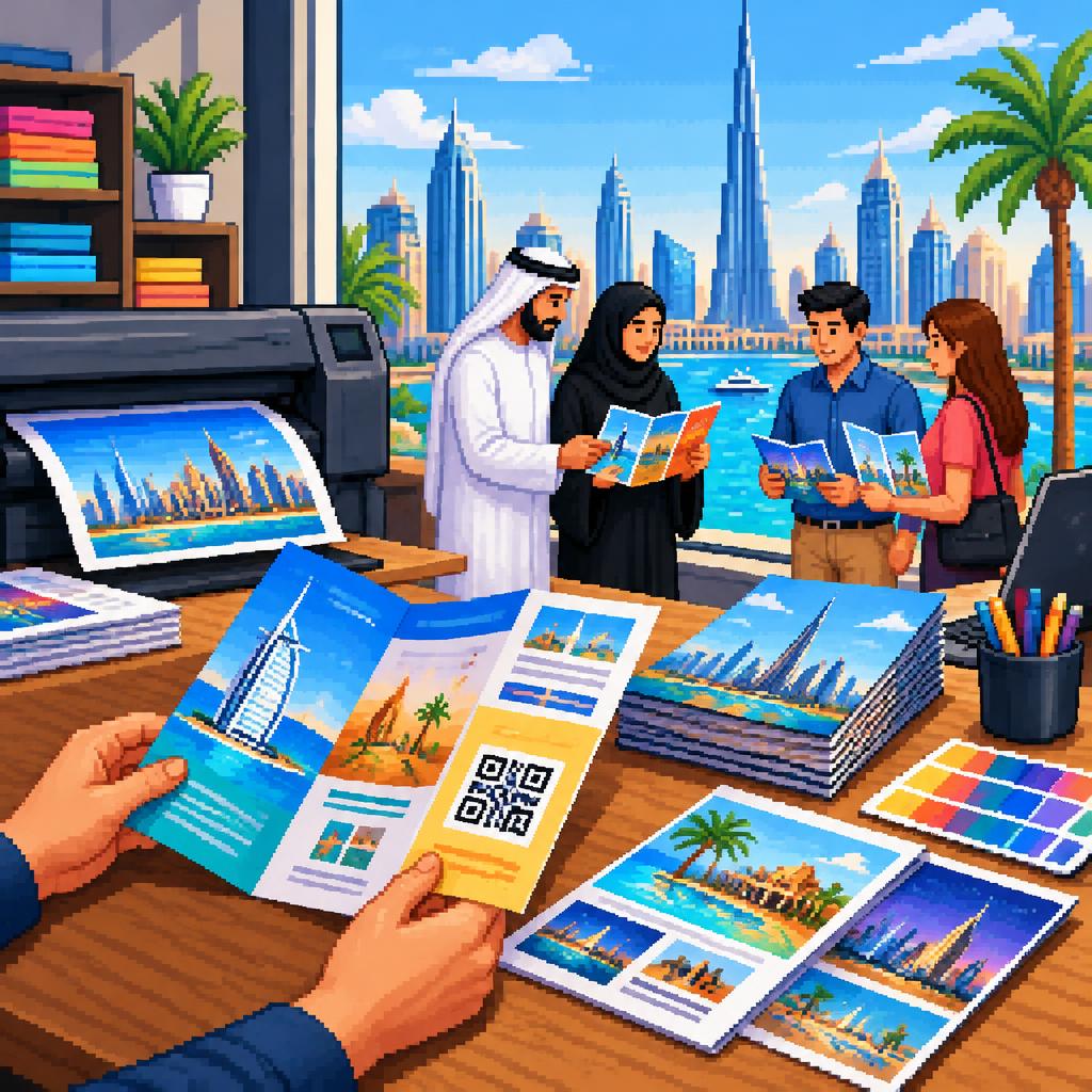
Why print still matters in Dubai
Even in a digitally connected city, well-designed brochures and flyers remain effective for local promotions, events, retail, and corporate branding. In Dubai’s busy public spaces and multicultural marketplaces, a compact printed piece can cut through digital noise, be handed directly to customers, and work alongside online campaigns. When produced with crisp printing and proper finishing, physical materials create a lasting impression — which is why many businesses pair print runs from a reliable printing press dubai with their digital channels for maximum reach.
Start with a clear goal and audience
Before design begins, define the single primary intent: inform, persuade, or drive a response. Dubai audiences are mixed — residents, tourists, business visitors and multilingual communities — so consider the most relevant segment for this piece. If your goal is fast local uptake (an in-mall offer, an event invite, or a restaurant menu), keep language concise, visuals obvious, and the call-to-action immediate. A focused objective helps you decide language approach, fold type, and which images or offers to prioritise.
Language choices: when to go bilingual
Arabic + English is the safest combination for broad reach in Dubai. Use short, bold headlines in both languages where space matters; put priority messaging in the reader’s expected language based on location and audience. For tourist-facing flyers, English-first with smaller Arabic may be fine; for neighbourhood services or government-related pieces, lead with Arabic. Wherever you include both, use consistent visual hierarchy so one language does not overwhelm the layout.
Typography and font sizes for fast readability
Choose legible typefaces and size your text for quick scanning. Headline sizes typically sit between 18–36 pt depending on format; subheads around 12–18 pt and body text no smaller than 9–10 pt for flyers and 10–11 pt for brochures. Maintain generous line spacing and avoid decorative fonts for long passages. Make sure Arabic and Latin typefaces pair well and preserve legibility across languages. Use bolding and colour blocks to break up content and guide the eye to the main offer or CTA.
Folds, formats and layout that suit the message
Choose a format that matches how the piece will be used. A single-page flyer works for quick promotions and handouts; bi-folds and tri-folds are useful for step-by-step explanations, menus, or service lists. Keep important information on the outer panels and the first inside panel so readers get the core message even if they don’t unfold everything. For brochures, use a clear left-to-right or right-to-left flow depending on the primary language, and leave breathing space around logos and contact details.
Images, colours and brand consistency
High-resolution images and consistent brand colours make printed pieces look professional and trustworthy. Use clean, contextual photos (products in use, venue shots, or lifestyle images) rather than busy collages. Ensure colours are set to CMYK for print and request colour-proofing from your printer to avoid surprises. Reviews of local providers often emphasise vibrant colours and sharp resolution as key differentiators, so plan imagery and colour choices with print output in mind.
Offers, CTAs and QR codes that drive action
A clear, time-bound offer increases response rates. Put the offer and the call-to-action (call, visit, scan) where they are first seen. Add a QR code that links directly to a mobile-optimised landing page, online menu, or booking form — make sure the QR is large enough (at least 2 x 2 cm on most flyers) and placed on a clear background for reliable scanning. Track responses where possible (unique landing pages or codes) to measure print ROI and refine future runs.
Paper, finishes and balancing cost vs impact
Paper weight and finish influence perception. Heavier stock and a gloss or satin finish feel more premium for brochures and corporate materials; lighter, matte papers are fine for high-volume flyers and outdoor handouts. Special finishes like spot UV, soft-touch coatings, or embossed elements add impact but raise costs — consider using them selectively on covers or business cards. Speak with your printing company dubai about sample swatches and test prints to match look, feel, and budget before committing to a full run.
Common design mistakes to avoid
Avoid tiny body text, low-resolution images, and poor contrast that hinder legibility. Don’t cram every product or service onto one panel — prioritise and guide the reader. Avoid placing crucial content too close to the trim edge; always include appropriate bleed and margins for printing. Be wary of overly complex QR flows (linking to non-mobile pages) and unclear offers without expiry or terms. Finally, check spelling and phone numbers carefully; errors waste budget and reduce trust.
Working with a local printer: practical checklist
To get the best result from a signage company in Dubai or printing press dubai, prepare a short checklist: finalised copy and approved images, preferred paper and finish, the exact fold/size, required quantities, delivery timeline and a request for a press proof. Local printers can advise on materials suited to Dubai’s climate and display conditions. Many customers commend quick turnaround and helpful pre-press communication when printers are engaged early — ask for samples, proof approvals, and clear delivery dates so you can meet launch schedules without last-minute surprises.
Final tips and next steps
Keep designs reader-focused: one clear message, obvious CTA, and visual hierarchy that directs attention. Use bilingual headlines where it increases reach, prioritise legibility in typography, and test QR links and landing pages before printing. If you’re sourcing print locally, choose a printing company dubai with credible sample work and responsive communication; satisfied customers often point to excellent print quality and on-time delivery as the difference between a flyer that gets read and one that doesn’t. When in doubt, request a short test run or a printed proof to ensure your design converts before scaling up.
Customer review


Article by
Al Wasal Printing Press - Printing Company in Dubai
Al Wasl Printing Press is one of the leading printing press companies in Dubai. We are your one-stop commercial printing company for all of your branding and publishing needs. We strive to provide our customers with the best and highest quality products available in the industry. Our Services Includes:- Digital Printing, Offset Printing Commercial Printing (Brochures, Flyers, Catalogues) Business Card Printing Letterhead & Stationery Printing Magazine & Book Printing Advertising & Display Printing Banner & Flex Printing Signage & Sign Board Printing (LED, Acrylic, etc.) Vehicle Branding & Wrapping Window Graphics & Glass Printing Packaging & Specialized Printing Packaging & Box Printing (Custom Packaging)